Just Puttzn' Around
You can’t teach old media new tricks
In an earlier post, where I ranted about the Charlotte Oberserver’s lack of coverage of the local hockey team, I alluded to the fact that I find the sports section of the site done incorrectly. Or maybe I should just come out and say that I don’t like it. Here is where I’ll give my own personal opinions of what is wrong.
Let me start off by saying I’m not a UI designer or an interface expert. I’m not even an individual that has a degree in marketing or experience in branding. My opinions may be completely wrong according to “theory” and may not even be practical. But, I’m a blogger and i get to have opinions, many of which are probably wrong. Now that I’ve gotten my CYA out of the way let me begin.
I’m choosing to start with the aspect that first drew my ire while researching my previous post. The individual blogs linked to an separate external blogger.com sites.
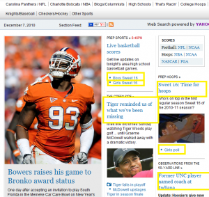
 On the left you’ll see a screen shot I grabbed at the time I started this post. It should be obvious that 6 of the 16 links have been outlined in yellow to draw your attention. Each of highlighted links actually direct you to a blogger.com page. One of the principal rules on web development is to try to keep people on your site as long as possible. There are many reasons for this. First of all it doesn’t make users/customers feel like you are trying to get rid of them. Why would you forcibly someone away from your core business?
Another reason this is typically frowned upon is that you lose branding. The blogger.com sites can be very nice and very professional looking. But in the case of these blogs they are using a generic, plain, template with a header at the top containing a simple Charlotte Observer header with links back to the main site. Between all of these pages there is no consistency. Some of the sites use google friend connect, while others have facebook connect. Some contain a way to contact the author via email, or follow them on twitter, while others have absolutely no social media interaction or way of contacting the author at all. None of this is a problem by itself, but it kills consistency and branding. On the topic of consistency it drives me crazy that the favico.ico, the tiny little icon that identifies the site with an icon when it’s in a tab, is different than the Observers branded icon. The blogger.com sites use the generic blogger.com “B” icon.
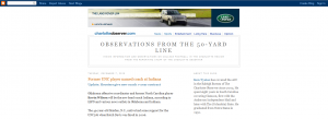
Beyond the aesthetic branding elements that are lost we also lose the entire URL branding that is essential in web development, The sites are named things like http://prepinsiders.blogspot.com/ and http://obsfifty.blogspot.com/ If someone happened across one of these sites from a search engine you would have no clue they were tied to the Observer at all or even to each other under a common theme of Charlotte sports. Yes there are links at the top of this page that link you to the Observer, but on a page this plain and generic, both in blogspot.com URL and graphically, it would be ignored by most surfers as nothing more than advertisements. The generic look and URL does not give the impression of professional news at all. Take a look at the next screen shot to see what I’m talking about.
The final point to this long winded post is that by taking users to a separate site is that you are losing ad revenue. After constantly reading how newspapers are failing and struggling to survive I’d think they would like to capitalize on as much revenue as possible. We’ve all become accustomed to seeing ads, and as long as they are relatively unobtrusive we don’t mind them surrounding our reading material.
There are many other points that could be made about SEO, site taxonomy, and plain old keeping your site fresh, and easily organized, where finding the content you are looking for is easy. I may try to hit on some of these at a later point.
[ad] Empty ad slot (#2)!
| Print article | This entry was posted by puttzy on December 8, 2010 at 3:39 am, and is filed under Charlotte, Development, My thoughts, Personal. Follow any responses to this post through RSS 2.0. You can leave a response or trackback from your own site. |


about 9 years ago
Deep thought! Thanks for conirtbuting.
about 9 years ago
Ray, if they forced age restrictions on this website, google fanboy teens like you and your foul mouth wouldn’t be allowed to make comments, do us all a favour and go geekingly fap at ur android plastic toy away from your mums and our eyesights LOL
about 9 years ago
Dirty dirty liar! Where are your tax returns Dirty Harry? Where did you get your money Dirty Harry? Where do you get the money for you posh living in D.C. Dirty Hary? I think I smell a skunk!
about 9 years ago
Apple now has Rhapsody as an app, which is a great start, but it is currently hampered by the inability to store locally on your iPod, and has a dismal 64kbps bit rate. If this changes, then it will somewhat negate this advantage for the Zune, but the 10 songs per month will still be a big plus in Zune Pass’ favor.
about 9 years ago
Well put, sir, well put. I’ll certainly make note of that.
about 9 years ago
That’s way more clever than I was expecting. Thanks!
about 9 years ago
This forum needed shaking up and you’ve just done that. Great post!
about 9 years ago
I like this weblog very much, Its a really nice position to read and receive information. “An idealist is a person who helps other people to be prosperous.” by Henry Ford.
about 9 years ago
Just realized I had commented on all since my last visit. I was so entranced by all of it, and now I’m caught up again. I so enjoy reading your blog, all the places that you go too, you make it so enjoyable. Now it is late so I guess I’ll call it a night, and hopefully dream of all these beautiful places.Take Care,Ulrike